


Brand Guidelines
This guide defines the visual language, design style, and principles that ensure a clear and consistent Kinelo brand experience—across teams, disciplines, and touchpoints.At its core, Kinelo is driven by clarity and care, reflecting our commitment to advancing breakthrough therapies for people living with immune-mediated diseases. These guidelines outline the visual and communication standards that bring our values to life and ensure Kinelo is expressed with purpose, consistency, and confidence.
01
Logo
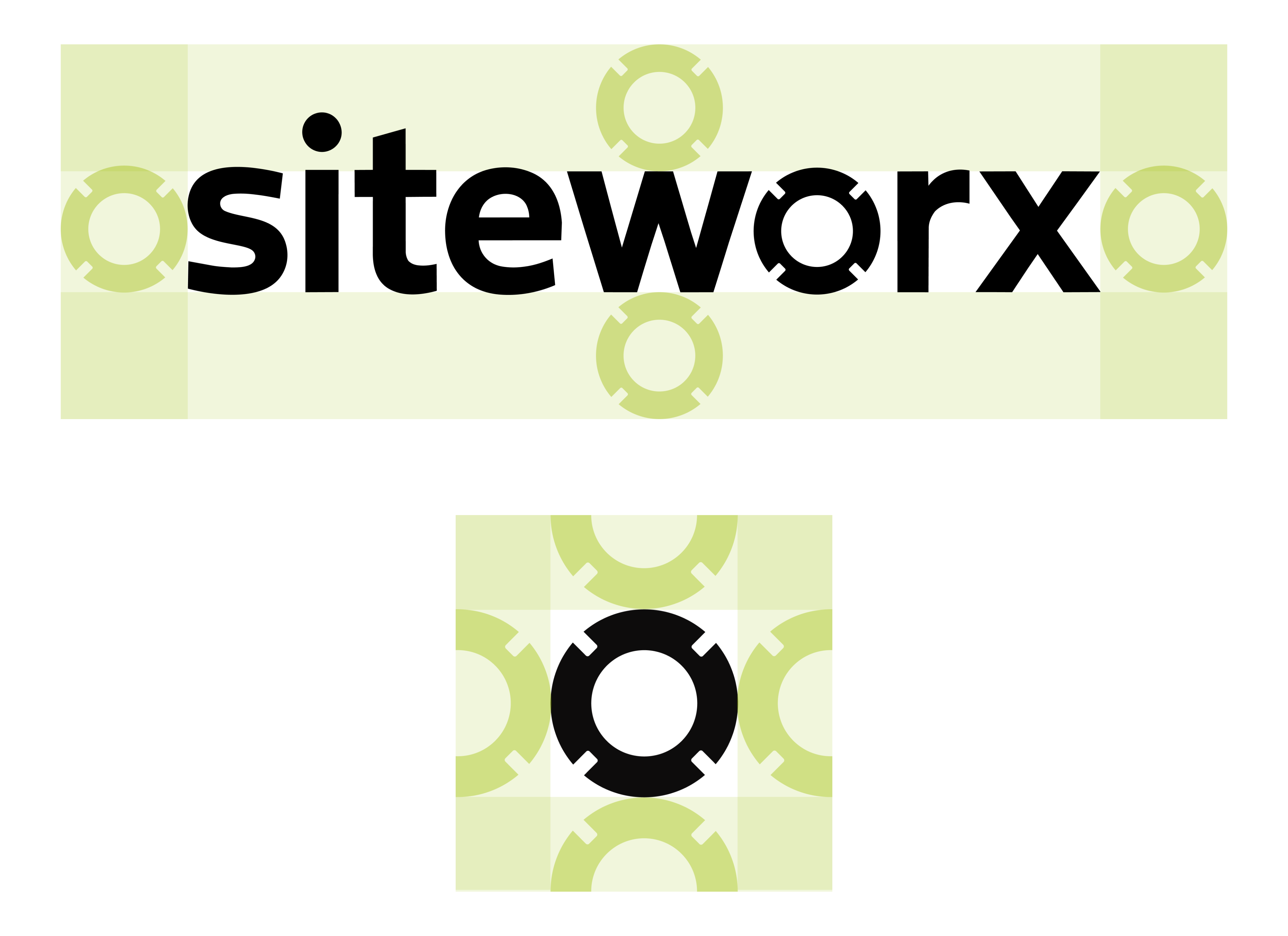
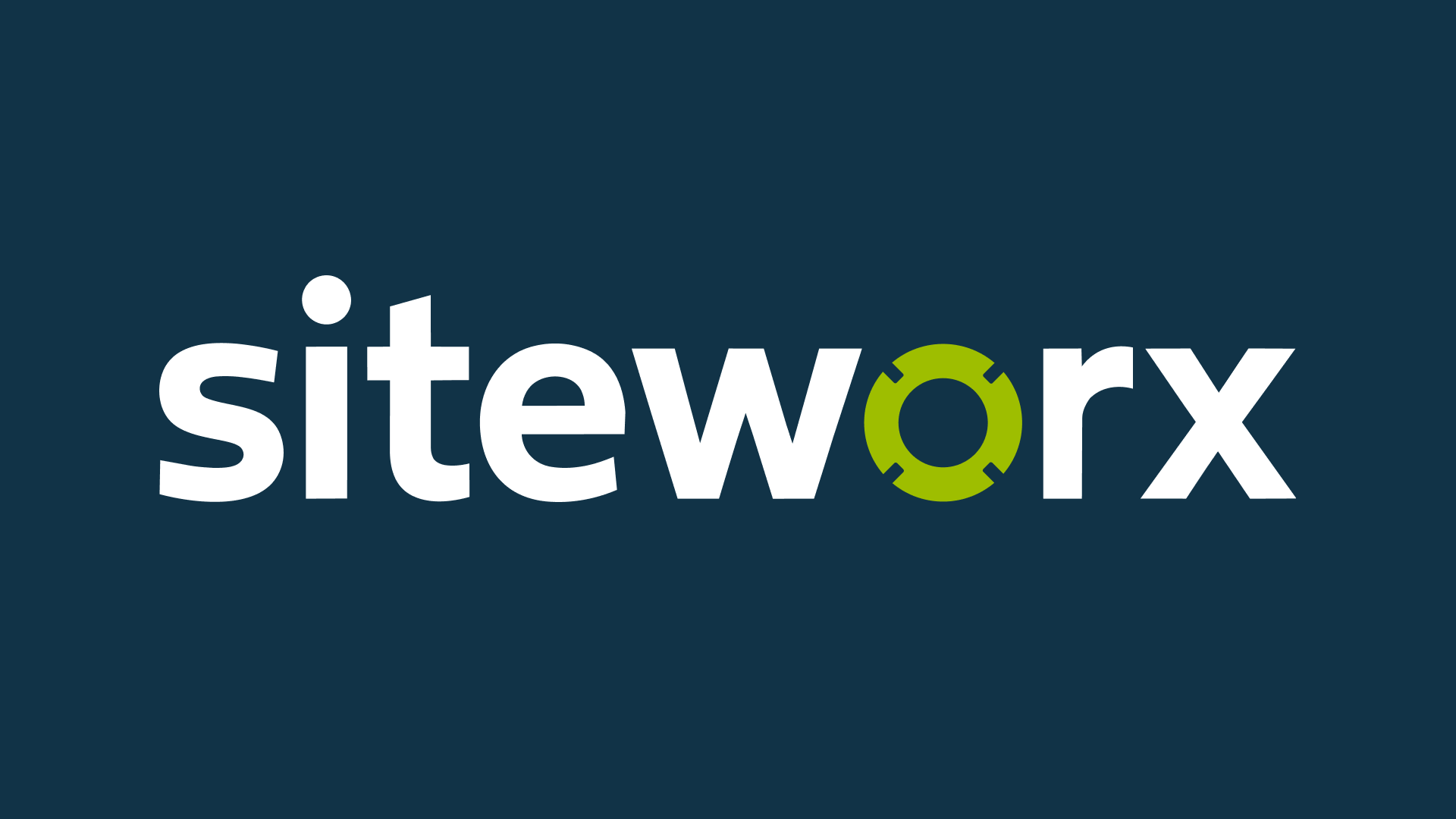
The SiteWorx Logo is inspired by the shape seen in the light sensor products. The “O” in “SiteWorx” represents a light sensor with notches around the edges. The word mark itself should always be used as the logo except in rare cases where only a small logo mark is necessary, ie, a favicon, a social media profile pic, etc.
1a
Primary Lockup

1b
Clearspace
1c
Secondary Lockups
1d
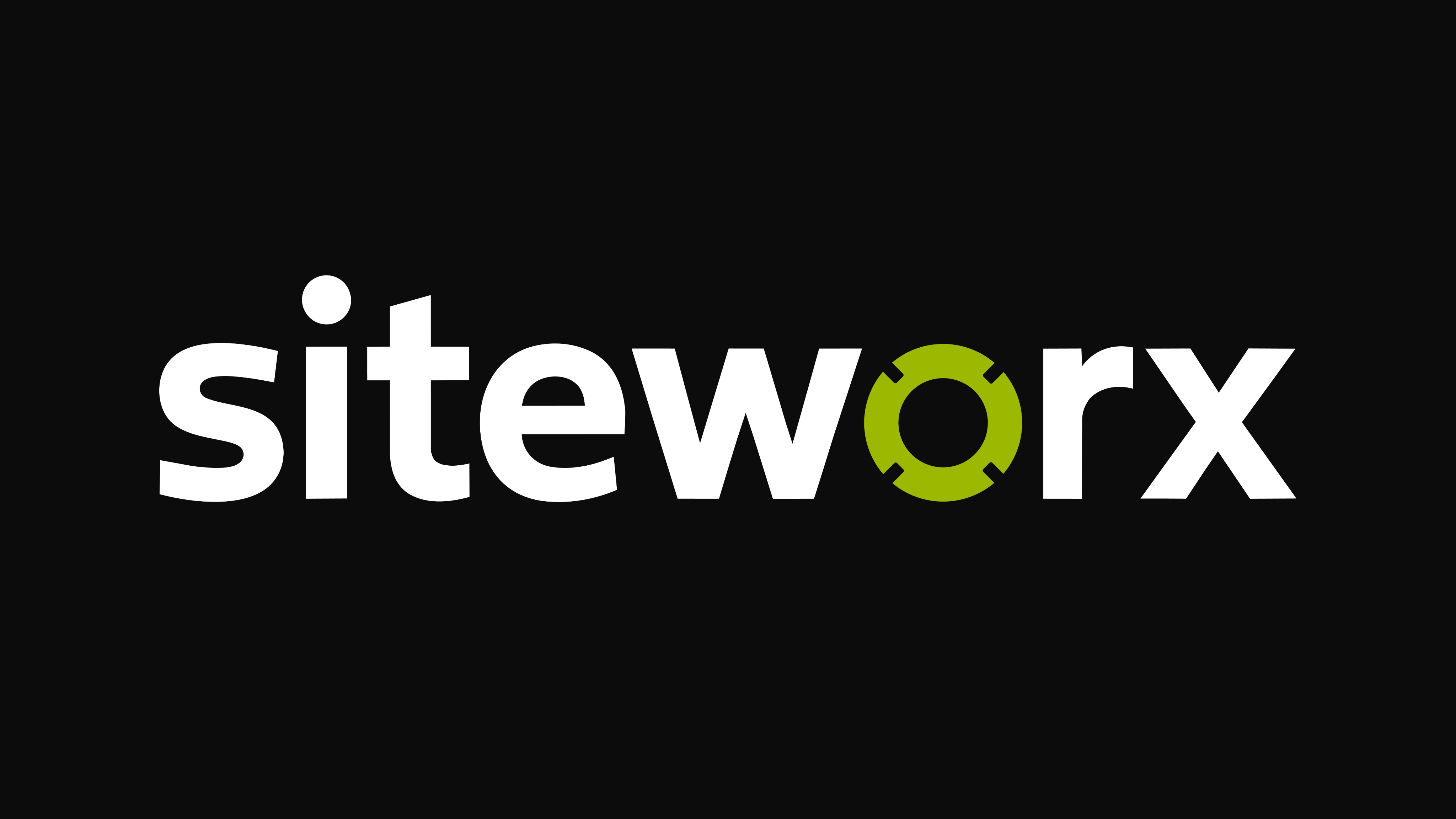
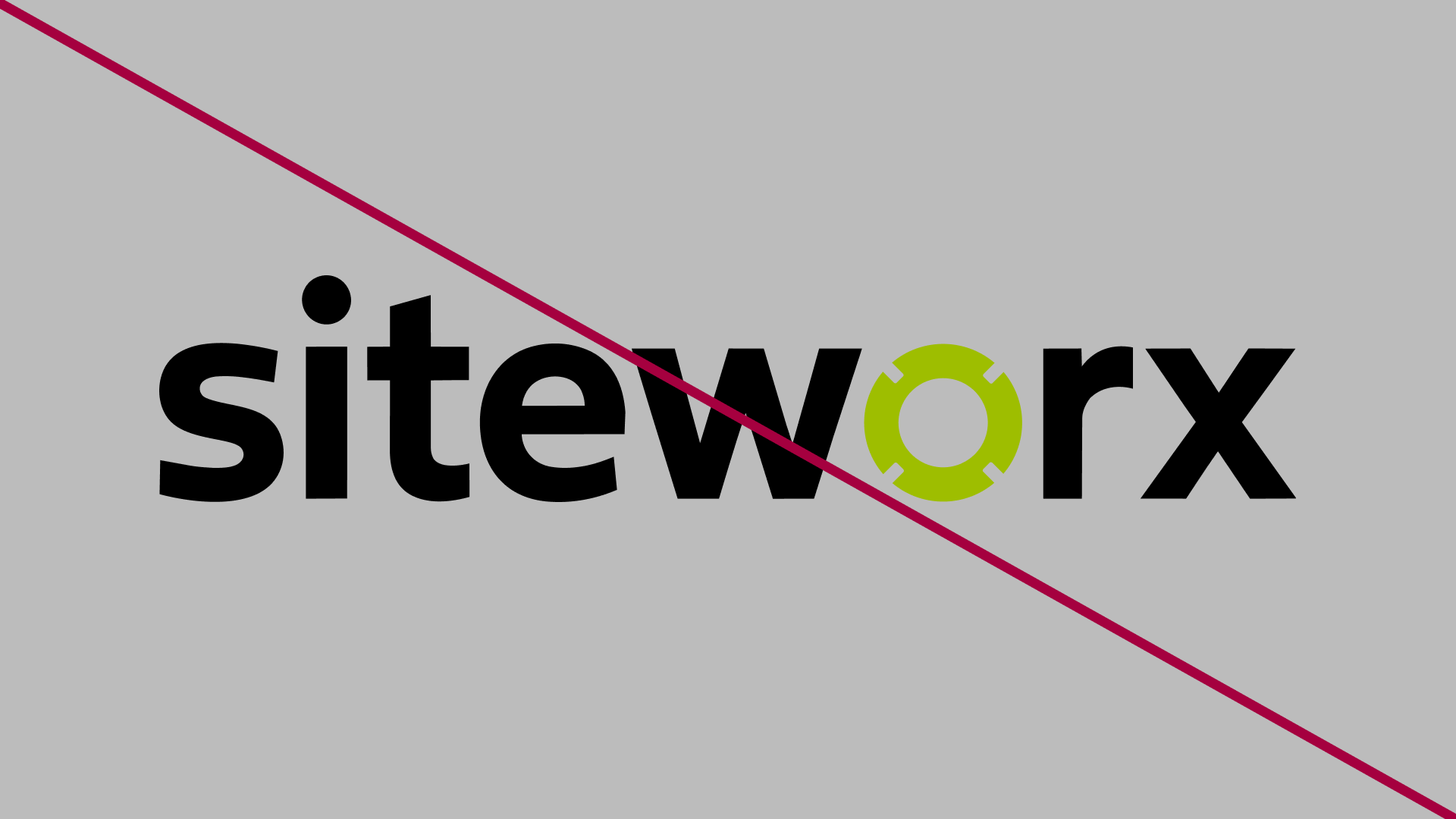
Do’s & Don’ts

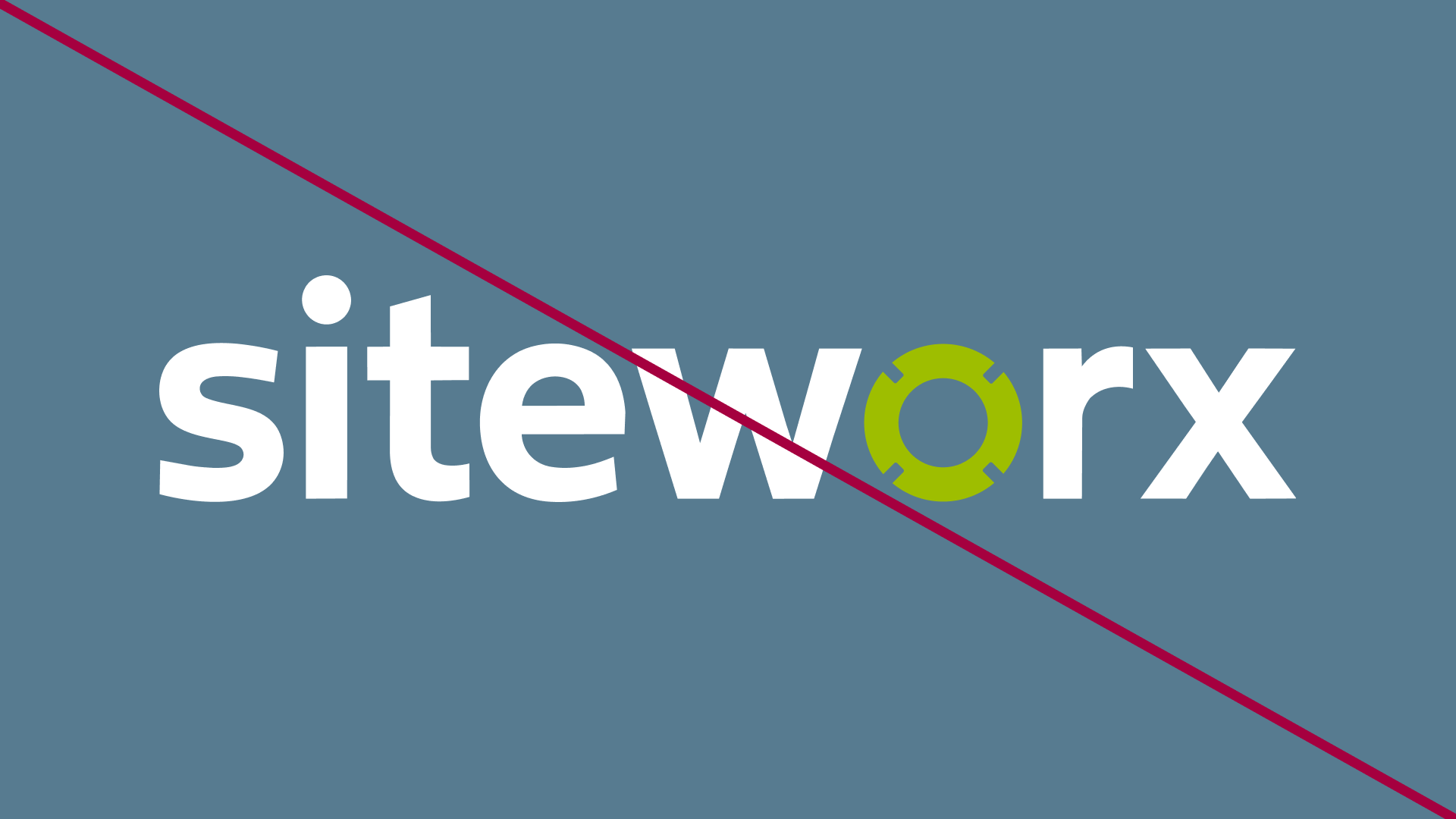
Don’t place the green on backgrounds of similar shade


Modify the logo or background to improve readability
Don’t match the primary logo with the light blue BG

Match the logo with the dark blue BG
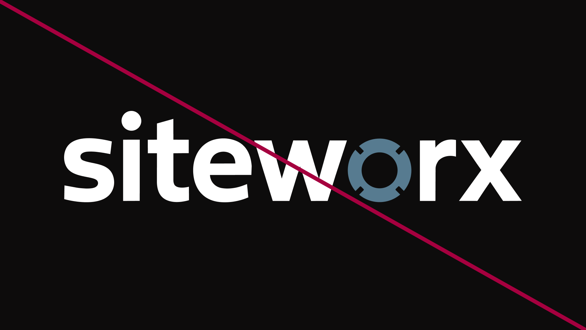
Don’t use the blues for the logo mark color
02
Color
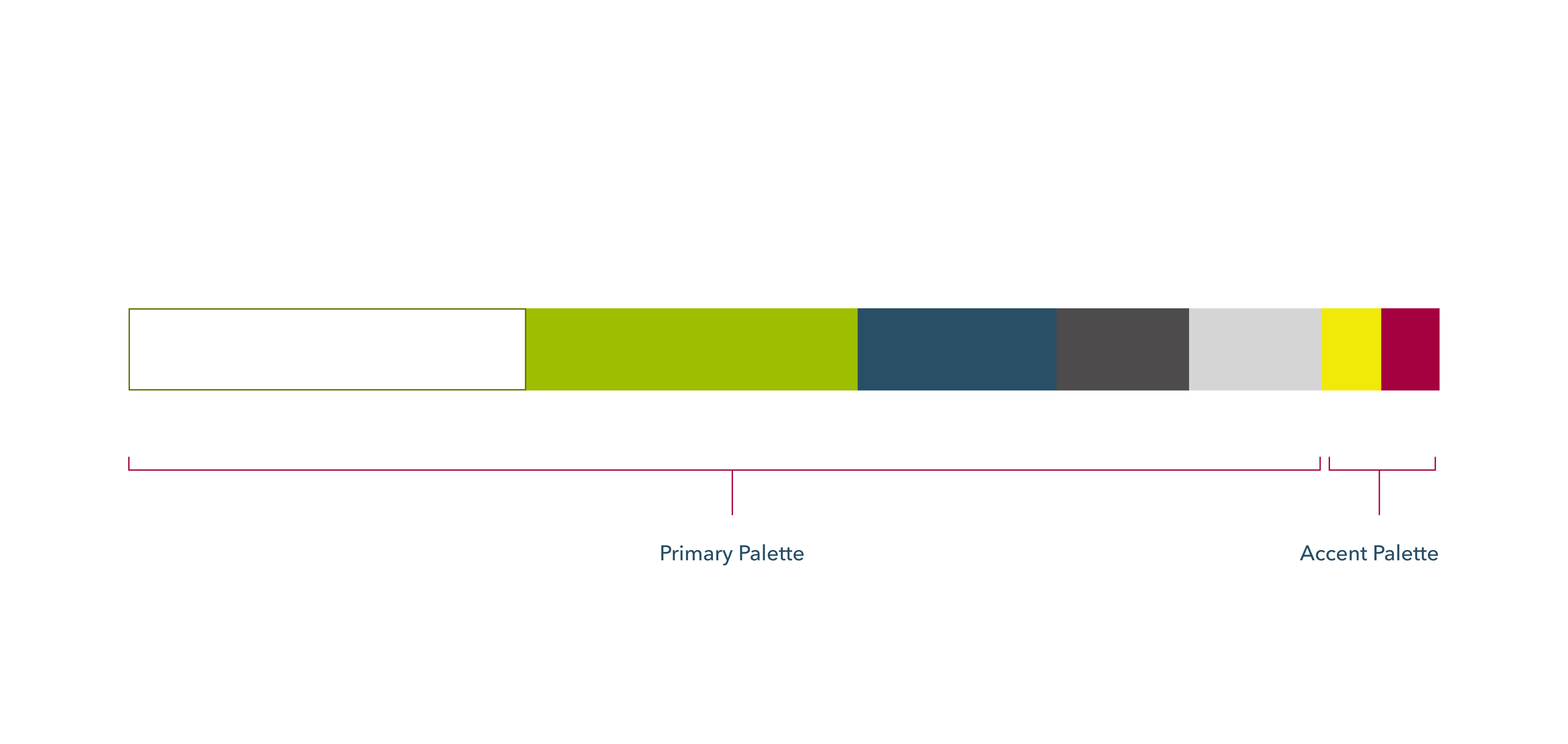
SiteWorx color palette is designed to be relatable to their clients and those in the industrial energy sector. The vibrancy of the green speaks to the energy that is managed, and the blue is muted and earthy, representing the positive impact that energy management has on the earth.
2a
Primary Palette
Volt Green
HEX - #9CB800
RGB - 156, 184, 0
CMYK 15, 0, 100, 28
PANTONE 137-1-6 C
Blueprint
HEX - #294F66
RGB - 41, 79, 102
CMYK - 60, 23, 0, 60
Cloud White
HEX - #FFFFFF
RGB - 255, 255, 255
CMYK - 0, 0, 0, 0
Coal
HEX - #0D0C0C
RGB - 13, 12, 12
CMYK - 0, 8, 8, 95
2b
Secondary Palette
Concrete
HEX - #D5D5D5
RGB - 213, 213, 213
CMYK - 0, 0, 0, 16
Flare
HEX - #A5003F
RGB - 165, 0, 63
CMYK - 0, 100, 62, 35
Electricity
HEX - #F1E908
RGB - 241, 233, 8
CMYK - 0, 3, 97, 5
2c
Gradient Palette
Volt Gradient
Cloud Gradient
Coal Gradient
Concrete Gradient
2d
Color Usage
03
Typography
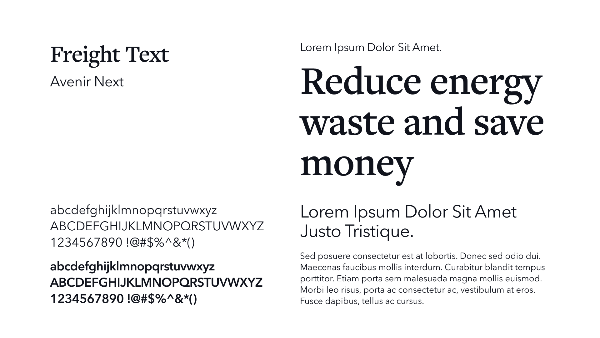
SiteWorx typography uses friendly headers, and clean, sans serif copy font. Freight Text brings an editorial polish to headers, giving the bround a grounded and human voice. Avenir next balenses that personality with clarity, making the brand feel practical and easy to navigate.
04
Photography Direction
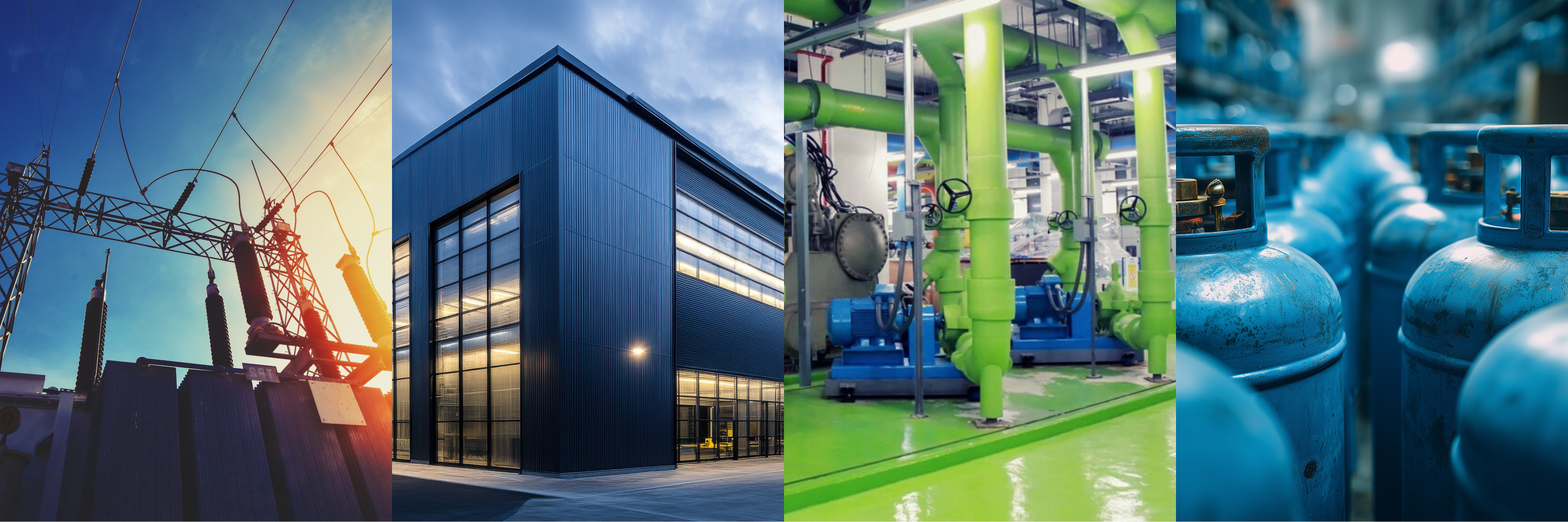
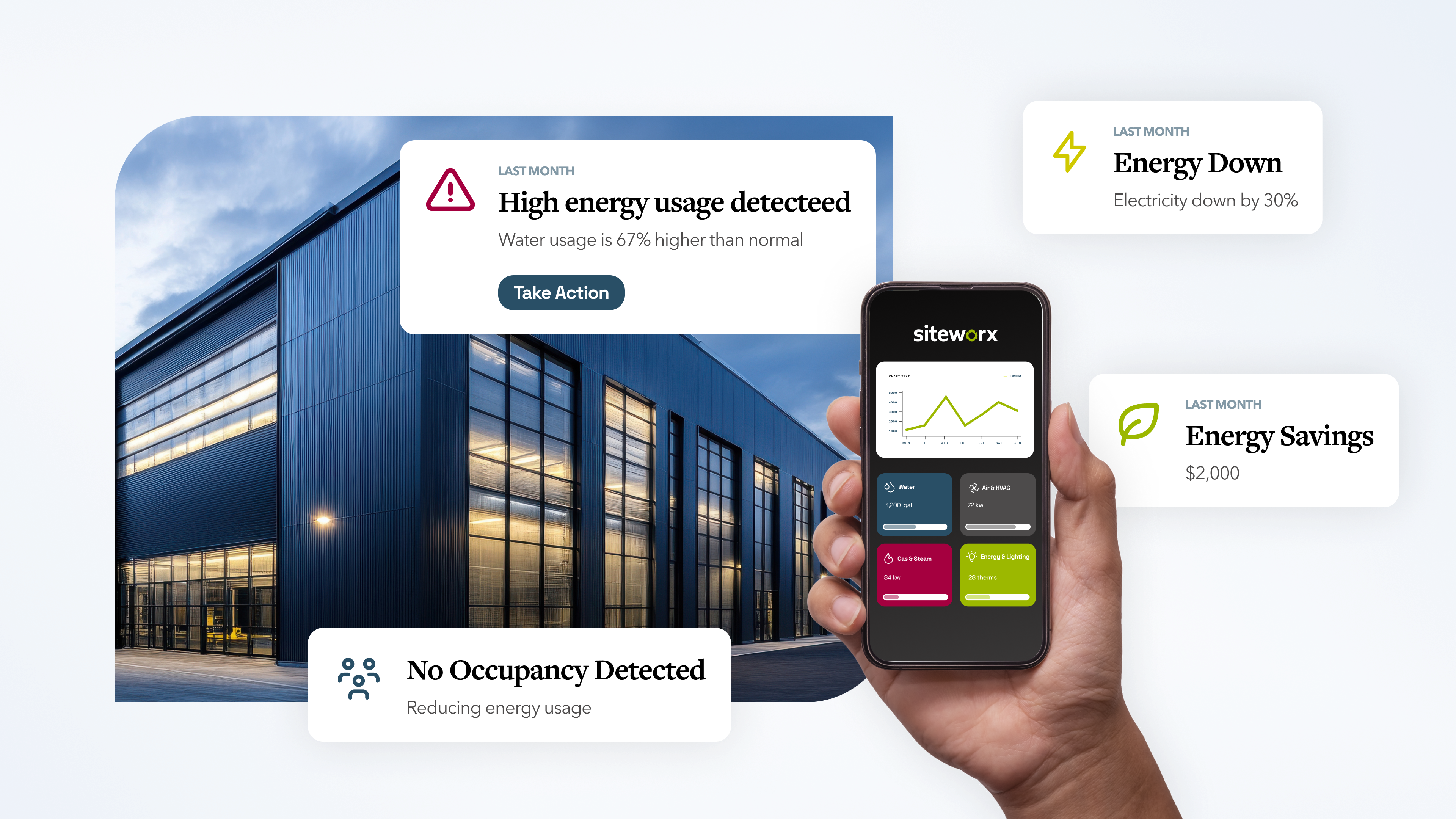
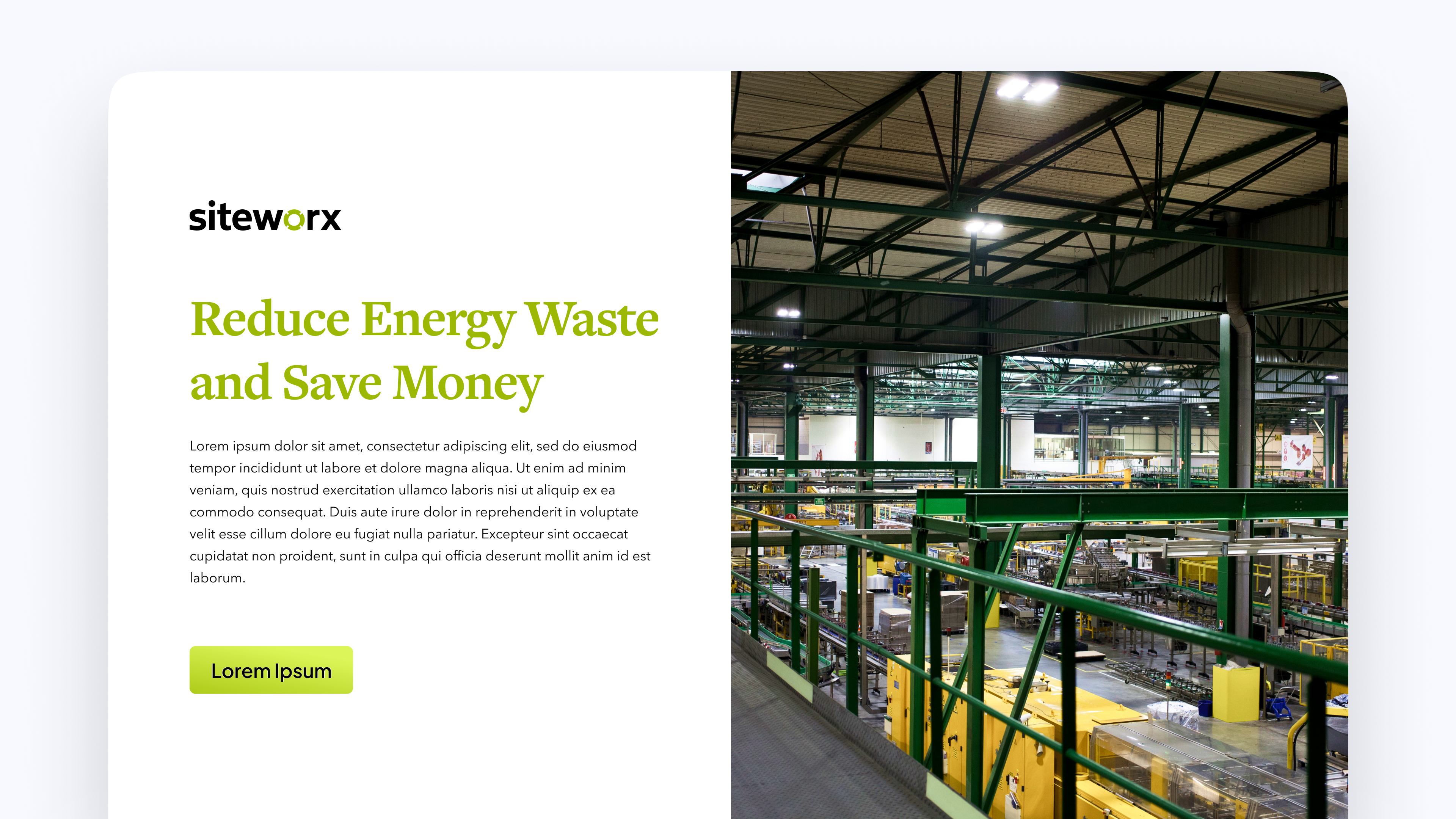
When possible, choose images that naturally echo the brand’s electric yellow, deep blue, black, white, gray, and high-contrast energy.SiteWorx photography should feel bright, energized, and operationally intelligent. Imagery should feature real-world building systems, utilities, infrastructure, sensors, dashboards, meters, industrial spaces, and commercial buildings, but it should avoid feeling dull, gray, or overly corporate.
When choosing imagery, prioritize photos that naturally contain one or more brand colors. Avoid imagery that feels generic, muted, overly staged, or unrelated to building operations. Photos of random offices, vague sustainability imagery, abstract leaves, or smiling business people should be used sparingly. SiteWorx should feel connected to real infrastructure, real buildings, and measurable resource management.
05
Personality & Voice
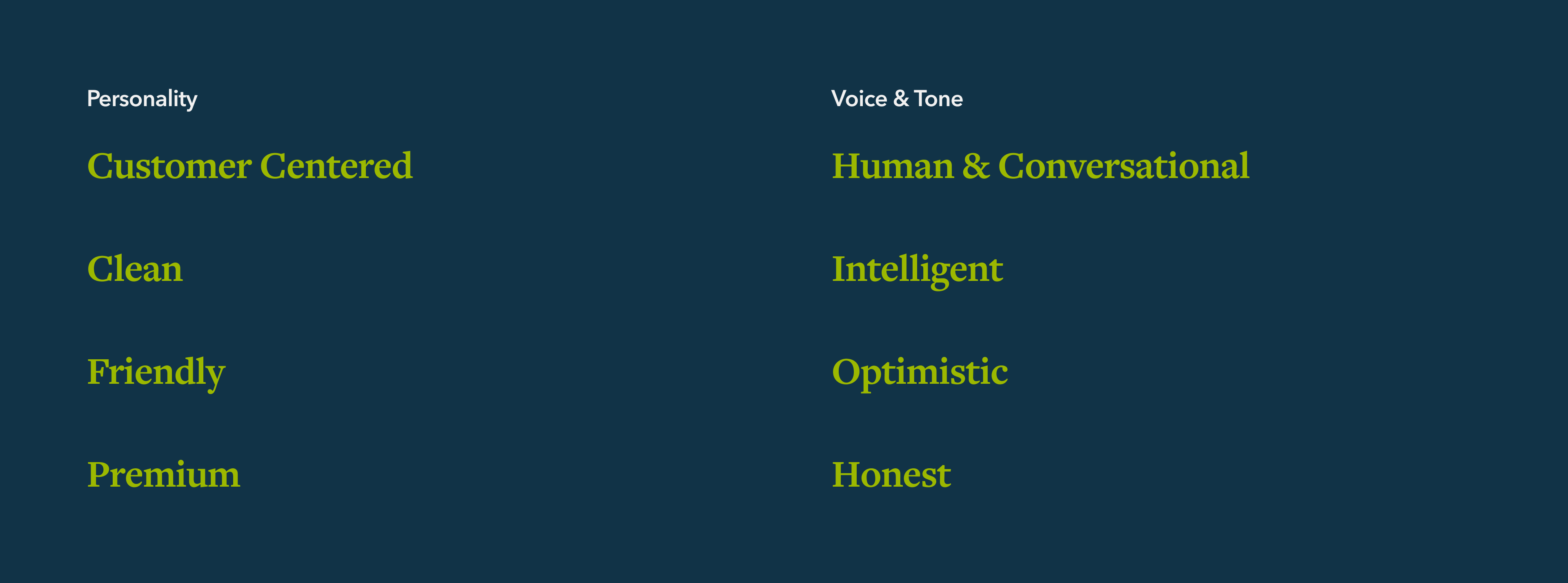
SiteWorx’s brand personality is calm, customer-centered, clean, friendly, and premium, making advanced technology feel simple and approachable. Its voice is human, intelligent, optimistic, and honest, avoiding robotic or overly complex language. Overall, the brand should communicate confidence, integrity, and smart operational progress without feeling intimidating or guilt-driven.
06
Putting it all together
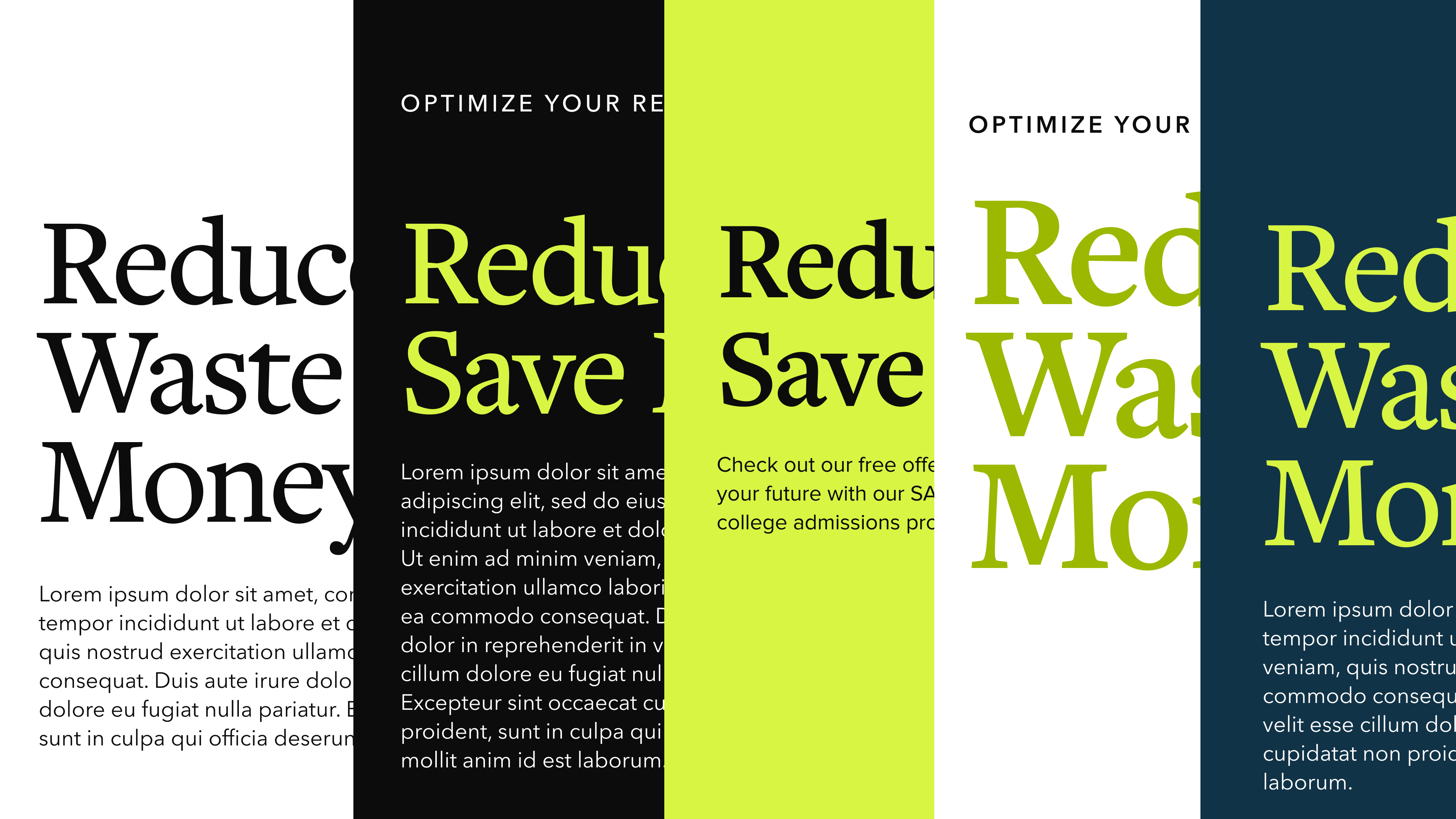
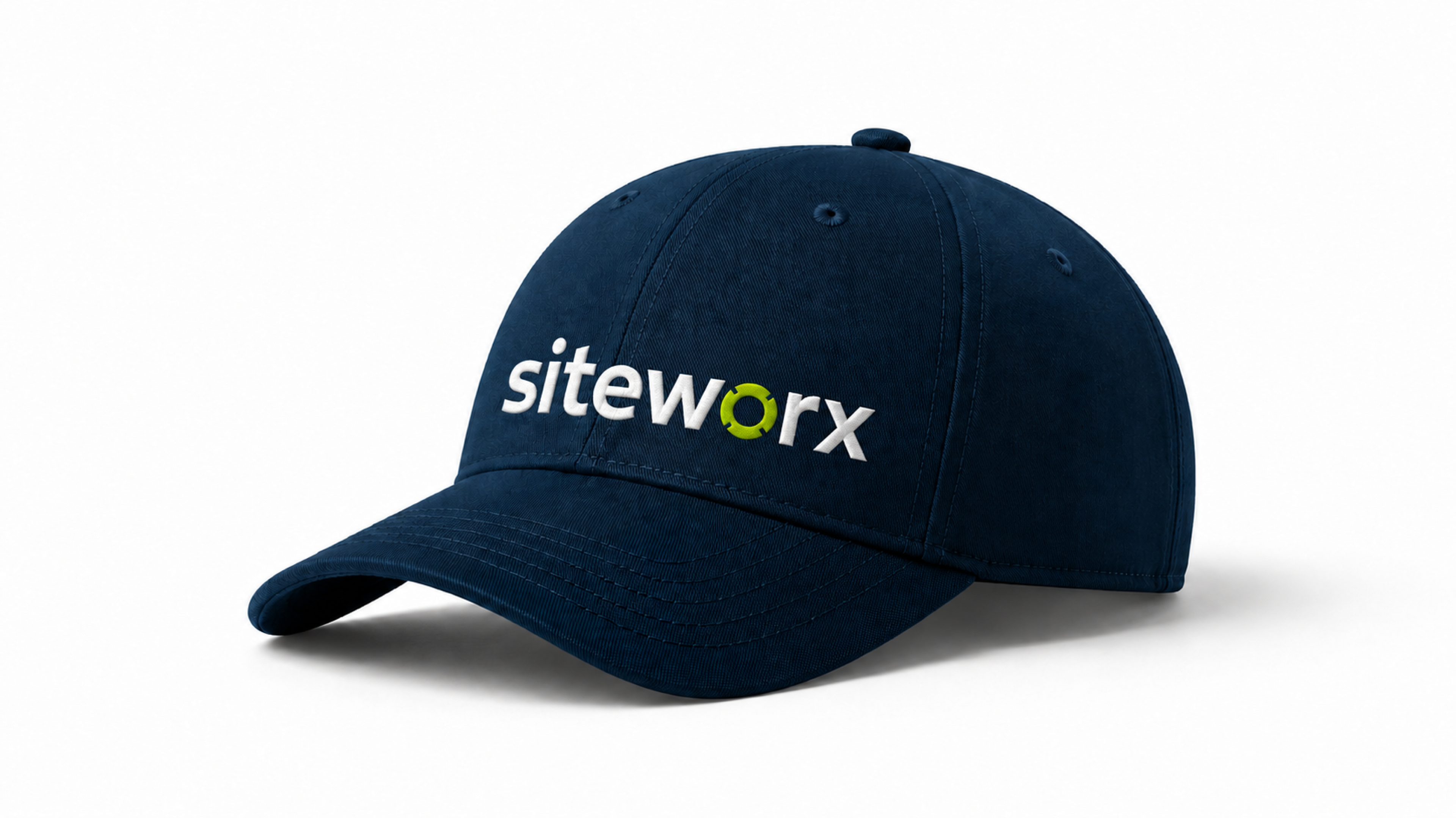
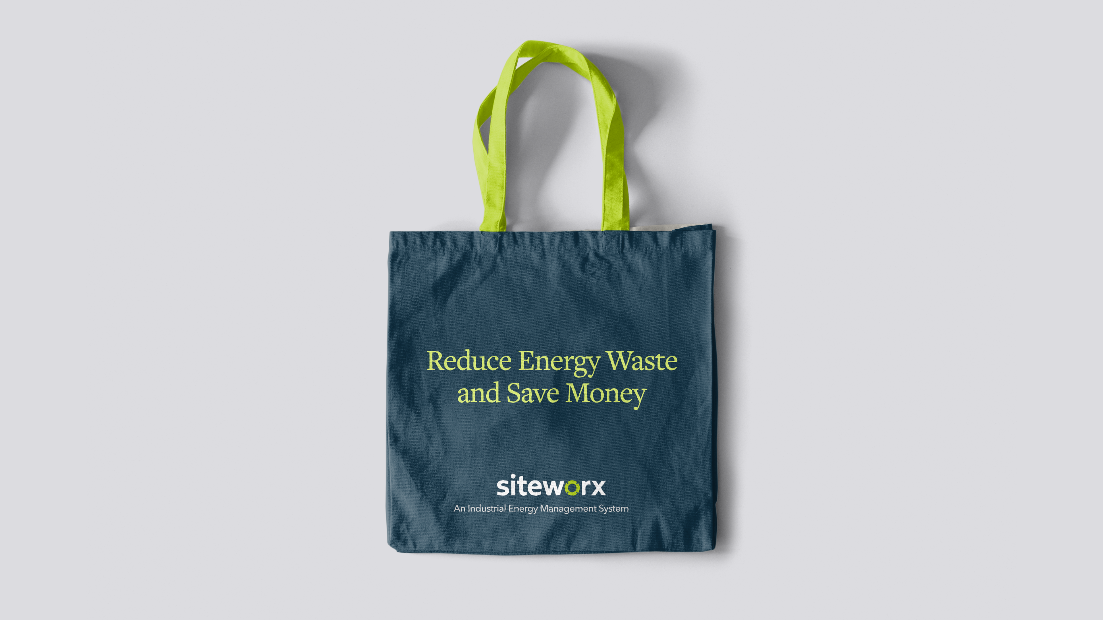
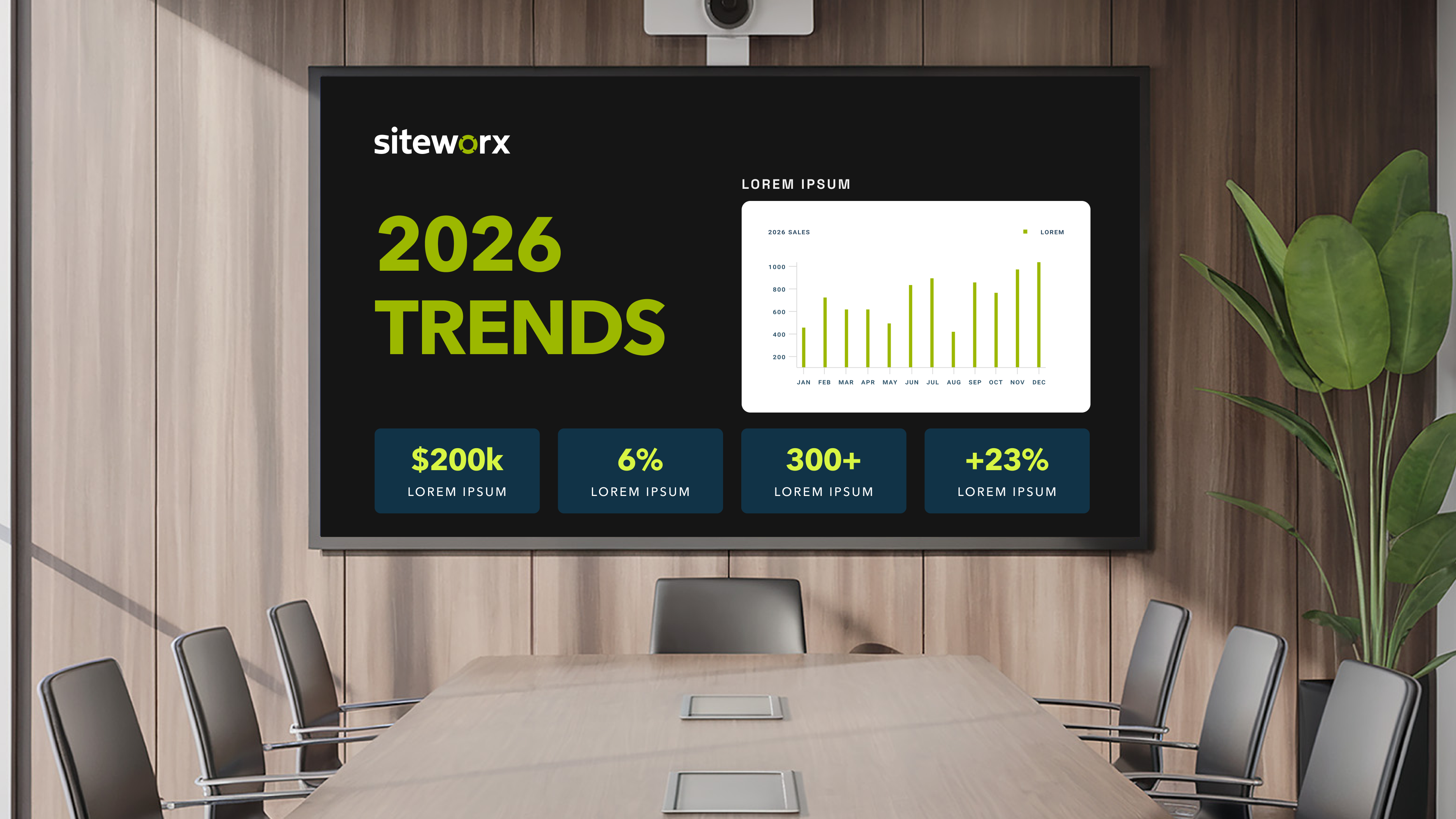
SiteWorx brand across various touch points should feel friendly and human. The volt green is thoughtfully paired with white to express friendly confidence, and paired with black or dark blue to grab the audience’s attention. All together, the brand provides a modern, simple, & trustworthy approach to the energy management industry.


Submit a Creative Request
Made with 💙 in Salt Lake City by Underbelly Creative.


Brand Guidelines
This guide defines the visual language, design style, and principles that ensure a clear and consistent Kinelo brand experience—across teams, disciplines, and touchpoints.At its core, Kinelo is driven by clarity and care, reflecting our commitment to advancing breakthrough therapies for people living with immune-mediated diseases. These guidelines outline the visual and communication standards that bring our values to life and ensure Kinelo is expressed with purpose, consistency, and confidence.
01
Logo
The SiteWorx Logo is inspired by the shape seen in the light sensor products. The “O” in “SiteWorx” represents a light sensor with notches around the edges. The word mark itself should always be used as the logo except in rare cases where only a small logo mark is necessary, ie, a favicon, a social media profile pic, etc.
1a
Primary Lockup
1b
Clearspace
1c
Secondary Lockups
1d
Do’s & Don’ts
Don’t place the green on backgrounds of similar shade
Modify the logo or background to improve readability
Don’t match the primary logo with the light blue BG
Match the logo with the dark blue BG
Don’t use the blues for the logo mark color
Only use the greens for the logo mark color
02
Color
SiteWorx color palette is designed to be relatable to their clients and those in the industrial energy sector. The vibrancy of the green speaks to the energy that is managed, and the blue is muted and earthy, representing the positive impact that energy management has on the earth.
2a
Primary Palette
Volt Green
HEX - #9CB800
RGB - 156, 184, 0
CMYK 15, 0, 100, 28
PANTONE 137-1-6 C
Blueprint
HEX - #294F66
RGB - 41, 79, 102
CMYK - 60, 23, 0, 60
Cloud White
HEX - #FFFFFF
RGB - 255, 255, 255
CMYK - 0, 0, 0, 0
Coal
HEX - #0D0C0C
RGB - 13, 12, 12
CMYK - 0, 8, 8, 95
2b
Secondary Palette
Concrete
HEX - #D5D5D5
RGB - 213, 213, 213
CMYK - 0, 0, 0, 16
Electricity
HEX - #F1E908
RGB - 241, 233, 8
CMYK - 0, 3, 97, 5
Flare
HEX - #A5003F
RGB - 165, 0, 63
CMYK - 0, 100, 62, 35
2c
Gradient Palette
Volt Gradient
Coal Gradient
Cloud Gradient
Concrete Gradient
2d
Color Usage
03
Typography
SiteWorx typography uses friendly headers, and clean, sans serif copy font. Freight Text brings an editorial polish to headers, giving the bround a grounded and human voice. Avenir next balenses that personality with clarity, making the brand feel practical and easy to navigate.
04
Photography Direction
When possible, choose images that naturally echo the brand’s electric yellow, deep blue, black, white, gray, and high-contrast energy.SiteWorx photography should feel bright, energized, and operationally intelligent. Imagery should feature real-world building systems, utilities, infrastructure, sensors, dashboards, meters, industrial spaces, and commercial buildings, but it should avoid feeling dull, gray, or overly corporate.
When choosing imagery, prioritize photos that naturally contain one or more brand colors. Avoid imagery that feels generic, muted, overly staged, or unrelated to building operations. Photos of random offices, vague sustainability imagery, abstract leaves, or smiling business people should be used sparingly. SiteWorx should feel connected to real infrastructure, real buildings, and measurable resource management.
05
Personality & Voice
SiteWorx’s brand personality is calm, customer-centered, clean, friendly, and premium, making advanced technology feel simple and approachable. Its voice is human, intelligent, optimistic, and honest, avoiding robotic or overly complex language. Overall, the brand should communicate confidence, integrity, and smart operational progress without feeling intimidating or guilt-driven.
06
Putting it all together
SiteWorx brand across various touch points should feel friendly and human. The volt green is thoughtfully paired with white to express friendly confidence, and paired with black or dark blue to grab the audience’s attention. All together, the brand provides a modern, simple, & trustworthy approach to the energy management industry.


Submit a Creative Request
Made with 💙 in Salt Lake City by Underbelly Creative.

Brand Guidelines
This guide defines the visual language, design style, and principles that ensure a clear and consistent SiteWorx brand experience—across teams, disciplines, and touch points.These guidelines outline the visual and communication standards that bring our values to life and ensure SiteWorx is expressed with purpose, consistency, and confidence.
01
Logo
The SiteWorx Logo is inspired by the shape seen in the light sensor products. The “O” in “SiteWorx” represents a light sensor with notches around the edges. The word mark itself should always be used as the logo except in rare cases where only a small logo mark is necessary, ie, a favicon, a social media profile pic, etc.
1a
Primary Lockup
1b
Clearspace
1c
Secondary Lockups
1d
Do’s & Don’ts
Don’t place the green on backgrounds of similar shade
Modify the logo or background to improve readability
Don’t match the primary logo with the light blue BG
Match the logo with the dark blue BG
Don’t use the blues for the logo mark color
Only use the greens for the logo mark color
02
Color
SiteWorx color palette is designed to be relatable to their clients and those in the industrial energy sector. The vibrancy of the green speaks to the energy that is managed, and the blue is muted and earthy, representing the positive impact that energy management has on the earth.
2a
Primary Palette
Volt Green
HEX - #9CB800
RGB - 156, 184, 0
CMYK 15, 0, 100, 28
PANTONE 137-1-6 C
Blueprint
HEX - #294F66
RGB - 41, 79, 102
CMYK - 60, 23, 0, 60
Cloud White
HEX - #FFFFFF
RGB - 255, 255, 255
CMYK - 0, 0, 0, 0
Coal
HEX - #0D0C0C
RGB - 13, 12, 12
CMYK - 0, 8, 8, 95
2b
Secondary Palette
Concrete
HEX - #D5D5D5
RGB - 213, 213, 213
CMYK - 0, 0, 0, 16
Electricity
HEX - #F1E908
RGB - 241, 233, 8
CMYK - 0, 3, 97, 5
Flare
HEX - #A5003F
RGB - 165, 0, 63
CMYK - 0, 100, 62, 35
2c
Gradient Palette
Volt Gradient
Coal Gradient
Cloud Gradient
Concrete Gradient
2d
Color Usage
03
Typography
SiteWorx’s typography uses friendly headers, and clean, sans serif copy font. Freight Text brings an editorial polish to headers, giving the brand a grounded and human voice. Avenir next balances that personality with clarity, making the brand feel practical and easy to navigate.
Download Freight Text Pro from Freight CollectionDownload Avenir Next from My Fonts
04
Photography Direction
When possible, choose images that naturally echo the brand’s electric yellow, deep blue, black, white, gray, and high-contrast energy.SiteWorx photography should feel bright, energized, and operationally intelligent. Imagery should feature real-world building systems, utilities, infrastructure, sensors, dashboards, meters, industrial spaces, and commercial buildings, but it should avoid feeling dull, gray, or overly corporate.
When choosing imagery, prioritize photos that naturally contain one or more brand colors. Avoid imagery that feels generic, muted, overly staged, or unrelated to building operations. Photos of random offices, vague sustainability imagery, abstract leaves, or smiling business people should be used sparingly. SiteWorx should feel connected to real infrastructure, real buildings, and measurable resource management.
05
Personality & Voice
SiteWorx’s brand personality is calm, customer-centered, clean, friendly, and premium, making advanced technology feel simple and approachable. Its voice is human, intelligent, optimistic, and honest, avoiding robotic or overly complex language. Overall, the brand should communicate confidence, integrity, and smart operational progress without feeling intimidating or guilt-driven.
06
Putting it all together
SiteWorx brand across various touch points should feel friendly and human. The volt green is thoughtfully paired with white to express friendly confidence, and paired with black or dark blue to grab the audience’s attention. All together, the brand provides a modern, simple, & trustworthy approach to the energy management industry.


Submit a Creative Request
Made with 💙 in Salt Lake City by Underbelly Creative.